

Hardcover Book Printing Guide: CMYK & Pantone Color Control
Related Posts
Bulk Custom Book Printing in China for Publishers and Brands
September 30, 2026
Children’s Book Printing for Publishers: 2026 Interactive Book Trends
September 30, 2026
Bulk Journal Printing Quality Control: Binding Strength, Page Order and Trim Accuracy
September 29, 2026
Softcover Book Printing in China: Short Runs, Bulk Orders and Reprint Planning
September 29, 2026
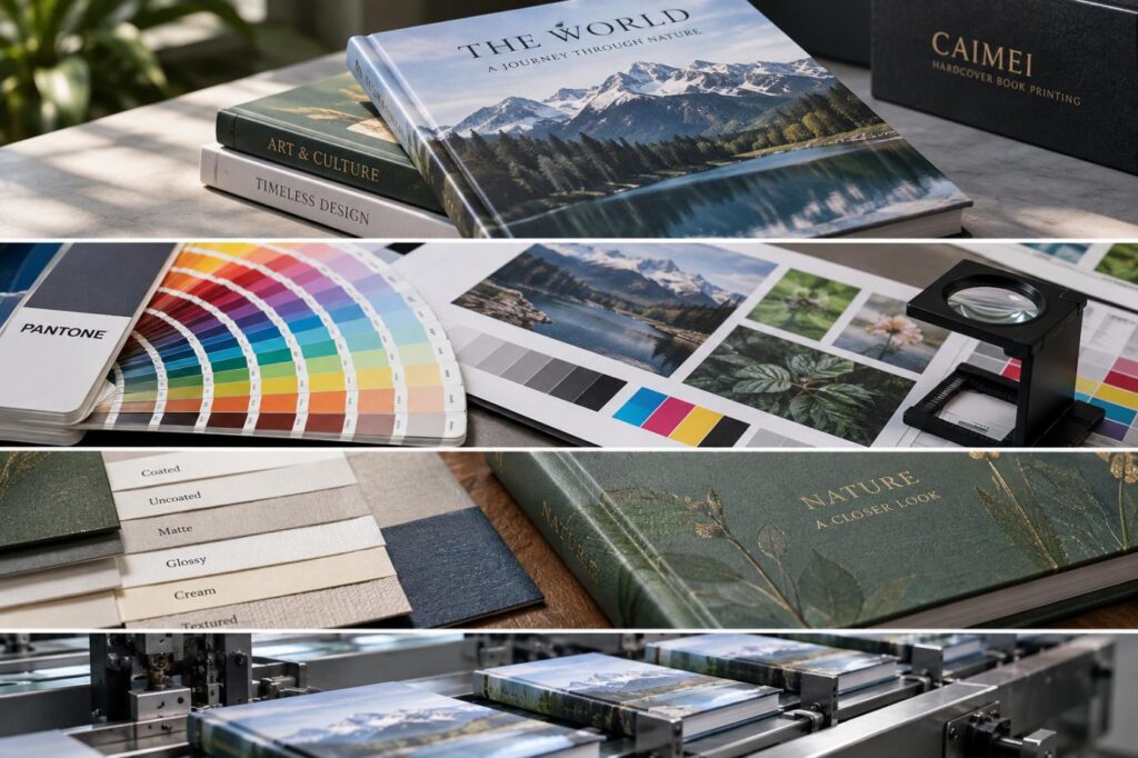
Color control in premium hardcover production is not simply a matter of choosing CMYK values. A hardcover project can combine coated interior pages, uncoated endpapers, printed case wrap, lamination, foil and board—all of which change how color is reproduced or perceived.

This Hardcover Book Printing Guide explains how CAIMEI approaches CMYK, Pantone, proofing, substrates and production control so publishers can define a realistic color target before mass production.
Why Approved Artwork Can Still Print Differently
The final printed color is the result of a system:
Artwork → ICC conversion → Separation → Ink → Paper → Press condition → Finishing → Viewing condition
Problems usually appear when buyers approve only the file but not the production condition.
Typical examples include:
•A corporate blue becoming duller on uncoated endpapers;
•Dark photographs losing shadow separation because total ink coverage is too high;
•A matte-laminated cover looking less saturated than the unlaminated proof;
•A reprint shifting because paper, ink or press conditions changed;
•The same sample appearing warmer or cooler under different lighting.
For hardcover books, these risks are greater because the cover, endsheets and book block may use different materials.
CMYK, Pantone or Both?
CMYK builds images from screened cyan, magenta, yellow and black. It is the normal choice for photography, illustrations and complex full-color pages.
Pantone spot colors use separately mixed inks and are better suited to controlled brand colors or shades outside the practical CMYK gamut.
| Printing Strategy | Best Use | Main Advantage | Main Limitation |
| CMYK | Photos, illustrations, general books | Efficient full-color printing | Cannot reproduce every saturated color |
| Pantone Spot | Logos, corporate colors | More controlled solid color | Additional ink and production cost |
| CMYK + Pantone | Premium brand and art books | Full-color imagery plus critical spot color | More complex press setup |
An important Hardcover Book Printing Guide rule is that a Pantone-to-CMYK conversion is only an approximation. Once converted into process values, it is no longer the original spot-color formulation.
Buyers should also distinguish Pantone references intended for coated and uncoated surfaces. A number alone does not guarantee identical visual appearance across different papers.
Control the File Before the Press
Color problems should ideally be corrected during prepress rather than on press.
For premium hardcover work, review:
ICC Output Condition
The ICC profile determines how source RGB or CMYK data is interpreted for the intended print condition. Do not convert files into an arbitrary CMYK profile simply because it is labeled “print.”
Total Area Coverage
Heavy CMYK builds can create excessive ink load in shadows. This can affect drying, detail and stability. The suitable TAC depends on the relevant printing condition rather than one universal percentage.
Black Construction
Small black text is normally handled differently from large solid-black backgrounds. Rich black can increase visual depth, but excessive CMYK combinations make registration and drying more difficult.
Neutral Gray
Art, photography and architecture books are especially sensitive to gray balance. A small CMY imbalance can introduce visible warm, green or magenta casts.
Paper Changes the Color Target
CAIMEI’s hardcover production options include coated, uncoated, art, matte-coated, glossy, cream, heavyweight, high-opacity and other paper types. Its hardcover range also supports sewn and casebound structures.
These materials should not share one blindly applied color target.
Coated Paper
Ink remains closer to the surface, generally supporting stronger image contrast and cleaner detail.
Uncoated Paper
Greater absorption normally produces a softer appearance and changes tonal behavior.
Cream Paper
The warmer substrate influences the apparent white point and therefore the overall color balance.
Art and Glossy Paper
These are more suitable where image detail, saturation and photographic reproduction are priorities. CAIMEI specifically positions art paper for high-quality image-heavy applications.
The practical rule is:
Approve color on the material system, not just on the artwork.
Finishing Must Be Included in Color Approval
Hardcover covers frequently receive post-print finishing. CAIMEI lists matte and glossy lamination, film lamination, UV coating, Spot UV, embossing and hot stamping among its available processes.
Finishing changes appearance even when the ink itself has not changed.
•Gloss lamination tends to increase perceived contrast and saturation.
•Matte lamination can soften contrast and reduce apparent color intensity.
•Spot UV creates local differences in gloss and therefore perceived density.
•Foil and embossing introduce reflective and dimensional surfaces that cannot be evaluated as ordinary CMYK areas.
For a premium cover, the meaningful approval point is therefore often the finished sample, not the raw press sheet.
Soft Proof, Digital Proof and Press Proof Verify Different Things
| Proof | Color Confidence | Actual Paper | Actual Production Condition |
| Monitor soft proof | Conditional | No | No |
| Contract digital proof | High when calibrated | Usually no | Simulated |
| Wet/press proof | High | Yes | Closest |
| Finished production sample | Final visual check | Yes | Yes |
A digital proof is useful for predicting a defined printing condition, but it does not automatically reproduce the interaction among actual stock, ink and lamination.
CAIMEI states that clients can obtain hardcover samples before mass production to assess paper, binding and cover finishing.
For high-value art books, luxury editions or tightly controlled brand colors, that physical approval stage can be more useful than approving a PDF alone.
Set Up and Maintain a Repeatable Color Workflow
For repeat orders, consistency depends on maintaining production references.
A professional workflow should record:
- Approved artwork version;
- ICC/output condition;
- Paper specification;
- CMYK and Pantone references;
- Proof or approved production sample;
- Finishing configuration;
- Measurement method;
- Agreed project tolerance.
Color-measurement equipment also needs consistent measurement conditions. ISO 13655:2017 defines spectral measurement and colorimetric procedures used in graphic arts and remains current.
This is especially important when optical brighteners are present, because measurement condition can influence reported Lab values.
Judge Color Under a Defined Viewing Condition
A sample should not be accepted under one office light and rejected under another.
ISO 3664:2025 defines viewing conditions for critical evaluation of printed images and replaced the earlier 2009 edition.
For critical colors, buyers can combine:
•Controlled visual evaluation;
•L*a*b* measurement;
•ΔE comparison;
•An approved physical reference.
However, this Hardcover Book Printing Guide does not recommend imposing an arbitrary universal ΔE number. Appropriate acceptance limits depend on the ink, substrate, print condition, measurement method and commercial requirements.
What Buyers Should Lock Before Mass Production
From CAIMEI’s manufacturing perspective, color approval should be treated as part of the complete hardcover specification.
Before production, confirm:
•CMYK, Pantone or CMYK + spot-color strategy;
•Exact cover, endpaper and interior stocks;
•Intended color profile;
•Critical Pantone references;
•Proofing level;
•Cover lamination or coating;
•Approved physical reference;
•Inspection and repeat-order requirements.
CAIMEI operates a dedicated hardcover production line and reports a 30,000+ m² production facility, alongside customizable paper, binding and finishing options. These capabilities matter most when they are connected to a clearly defined print specification rather than treated as isolated production features.
For publishers preparing art books, illustrated editions, corporate books or premium casebound projects, the best starting point is to share the artwork, paper requirements, critical colors and finishing expectations before proofing. CAIMEI’s hardcover book printing service can then be used to review suitable materials, binding and sample options before the project moves into bulk production.
FAQs
Q1. Does CAIMEI support both CMYK and Pantone colors for hardcover book printing?
Yes. CAIMEI can produce full-color CMYK hardcover books and can also discuss Pantone spot-color requirements for projects where specific brand or decorative colors need tighter control.
Q2. Can CAIMEI provide a physical sample before hardcover book mass production?
Yes. Physical samples can be arranged so buyers can evaluate paper, hardcover construction, printing appearance and cover finishing before approving bulk production.
Q3. What paper options does CAIMEI offer for premium hardcover books?
CAIMEI offers multiple paper choices, including coated, uncoated, art, matte-coated, glossy, cream, heavyweight and high-opacity papers. The appropriate stock depends on image content, reading requirements and desired color reproduction.
Q4. Can CAIMEI help match colors between the hardcover and interior pages?
CAIMEI can coordinate the production specification around the selected cover and interior materials. Because different substrates reproduce color differently, critical colors should be reviewed through proofing or physical samples rather than relying only on identical CMYK values.
Q5. Does matte or glossy lamination affect hardcover book colors?
Yes. Gloss lamination can increase perceived contrast and saturation, while matte lamination may soften the visual appearance. CAIMEI recommends evaluating critical cover colors together with the intended finishing process.



NAME
text text text text. text text text text. text text text text. text text text text. text text text text. text text text text. text text text text. text text text t text xt. text text text text. text text text text. text text text t text
Contact Us
In This Article
Related Posts
Bulk Custom Book Printing in China for Publishers and Brands
September 30, 2026
Children’s Book Printing for Publishers: 2026 Interactive Book Trends
September 30, 2026
Bulk Journal Printing Quality Control: Binding Strength, Page Order and Trim Accuracy
September 29, 2026
Softcover Book Printing in China: Short Runs, Bulk Orders and Reprint Planning
September 29, 2026


